TYPESETTING, GRAPHIC DESIGN AND WEB DEVELOPMENT
GLOSSARY OF TERMS
Blank

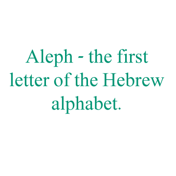
Aleph

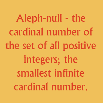
Aleph-null

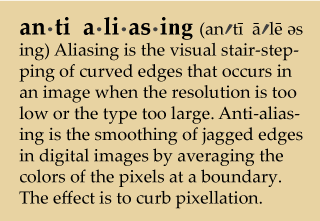
Anti-Aliasing

Ampersand
Ampersand: The symbol that stands for the word and. The word is a contraction of
[and - per se - and].
READ MORE

Asterisk
Asterisk: the figure of a star used in writing and printing as a reference mark or to indicate omission, doubtful matter, etc. The asterisk has long been used in computing as a wildcard character in searches and often may act as a representation of zero or more characters.

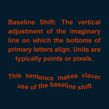
Baseline Shift

Big Jus
Big Jus: A character from Cyrillic script representing two slavic nasal vowels. By far the best-looking piece of Russian type.


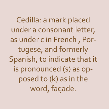
Cedilla
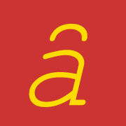
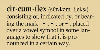
Circumflex

Contextual Alternates
Contextual Alternates: Are alternate characters included in some script typefaces to provide better joining behavior. For example, when using Caflisch Script Pro with contextual alternates enabled, the letter pair “bl” in the word “bloom” is joined so that it looks more like handwriting.

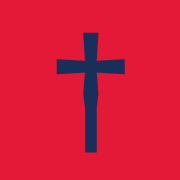
Dagger
Blank
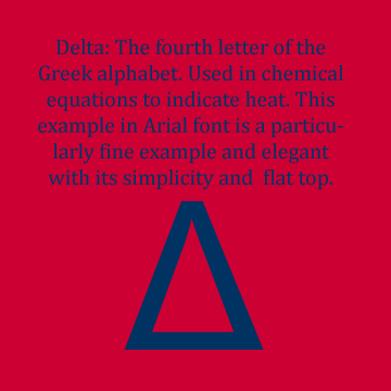
Delta

Degree
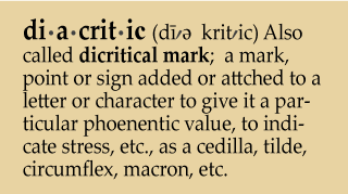
Diacritic

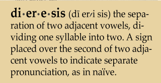
Dieresis

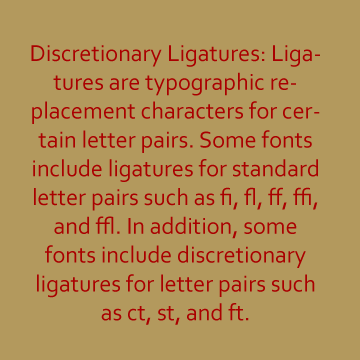
Discretionary Ligatures
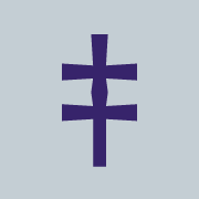
Double Dagger

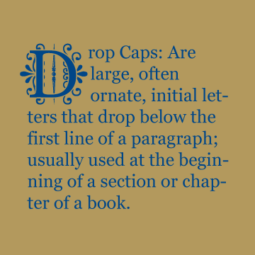
Drop Caps

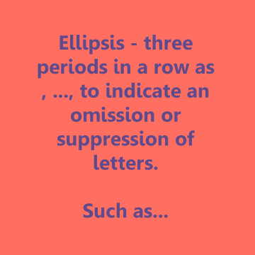
Ellipses

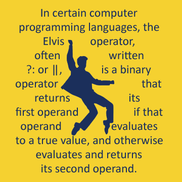
Elvis Operator


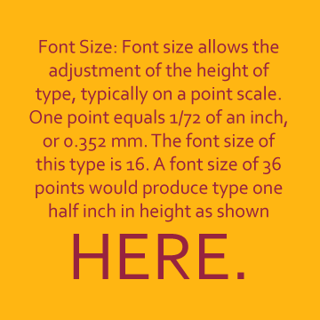
Font Size
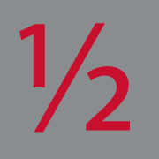
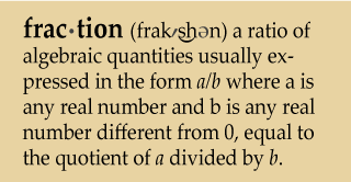
Fractions

G with Stroke
G with Stroke: A letter derived from the Latin alphabet letter G, combined with a bar diacritic denoting the partially voiced palatal spirant used to represent the voiced uvular stop ɢ.

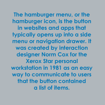
Hamburger Menu


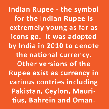
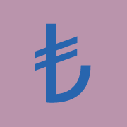
Indian Rupee

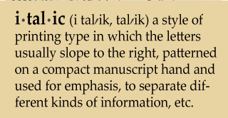
Italic


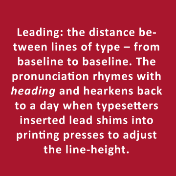
Leading


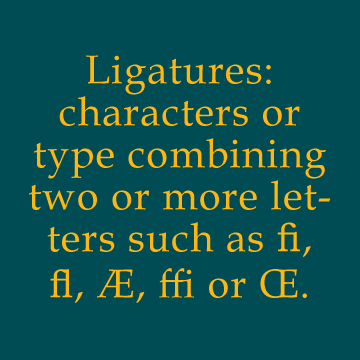
Ligatures


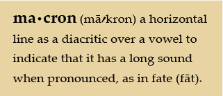
Macron


Octothorp
Octothorpe: Also known as Pound Sign and Hashtag. The origin of the word is disputed, but is relatively new as it emerged from the telephone company, Bell Labs, during the 1950s or 60s and is the special key on the lower right of a telephone keypad.


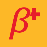
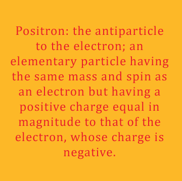
Positron

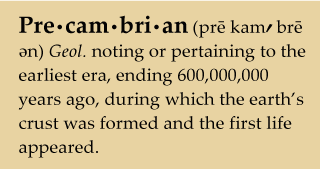
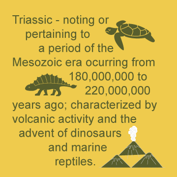
Precambrian
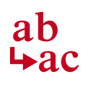
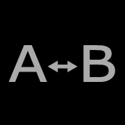
Replace


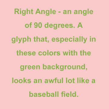
Right Angle

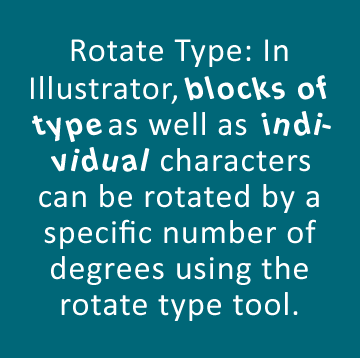
Rotate Type


Small Caps
Small Caps: Lowercase characters typeset with glyphs that resemble uppercase letters ("capitals") but reduced in height and weight, close to the surrounding lowercase (small) letters.


Styles and Formatting
Styles and Formatting: In Microsoft Word styles are used to "tag" or identify parts of a document. An example of this is whether text is part of a heading, a footnote, a hyperlink, or body text. These are all examples of styles in Word.

Stylistic Sets
Stylistic Sets: A character that symbolizes the exclusive right to ownership of any recorded material.


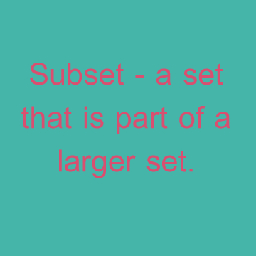
Subset

Swash


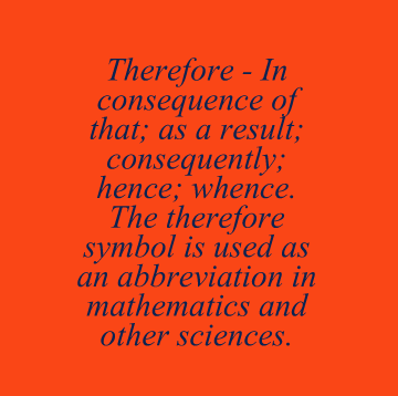
Therefore

Tibetan \Na\


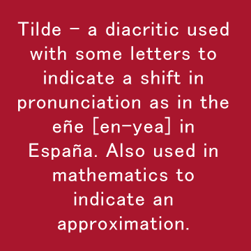
Tilde

Titling Alternates
Titling Alternates: Lowercase characters typeset with glyphs that resemble uppercase letters ("capitals") but reduced in height and weight, close to the surrounding lowercase (small) letters.


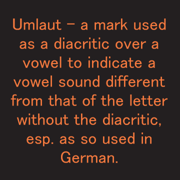
Umlaut